Wednesday, September 8, 2021

Wet Plate Collodion- Brooke Hockspiel


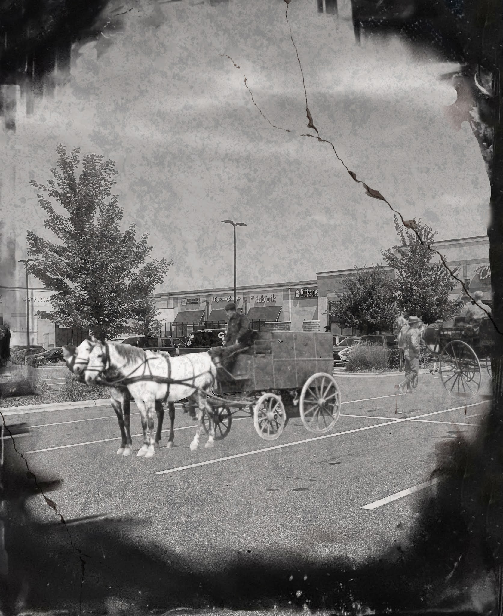
For my concept, I wanted to take a very urbanized shopping center in Charlotte and create a humorous piece by adding in carriages. I think it contrasts well, as shopping centers definitely did not exist back then and it's unique to see carriages in this kind of a setting. I created this by taking images of carriages from the Library of Congress and adding them to my original photo taken of a shopping center parking lot.


6 comments:

  1. I think your concept is really strong and you did a great job of merging the images together to look like one. It reminds me of the horse and carriage rides in NYC. The only thing I can think to change is to many add more blur in the distance and blow out the sky to look more white and flat.

    ReplyDelete
  2. Your concept is original and funny, and your photo definitely shows that. Some things that could be added to help the photo look more realistic, add a shadow beneath the carriage and horses. Also there is a tool to help with perspective, so the parking lot and carriage could match. The editing marks and scratches look good too though, and the edges have a nice bloshy touch.

    ReplyDelete
  3. I really like this piece. It’s funny and creative especially when you taking two different images and merged them together to form as one. The distress and burn feel on the image I feel like goes perfect with what you were tying to accomplish making this feel more natural. Only thing I would say needs to be fixed is the sharping on the images at least to make out a facial feature but otherwise I think this is great.

    ReplyDelete
  4. The concept is whimsical and thoughtful and comes across pretty well. I do think I would have modified the background buildings so that the contemporary structures were more apparent. Great work aligning the carriage with the parking space.

    ReplyDelete
  5. This is a very interesting concept, at first i had to really look at the photo to see that they were masked into the original image. I like the idea and some of the techniques that were used in order to make this very successful. The border gives it that centered look while at the same time it's not really centered and the carriages really make you stray from the center and I think that was a nice touch. The only thing I would critique here is maybe to add less of the border for us to have a greater sense of the area we are looking at.

    ReplyDelete
  6. There was something that threw me off at first glance and then I figured out what it was, you are missing a shadow on the main carriage. You did a good job choosing the images with the same point of view but a shadow will definitely improve this work. I also enjoy the element on the edge creating a sort of vignette, it help lead the eye to your main subject.

    ReplyDelete